
Small but powerful, components are the essential building blocks that give you control over your website’s content. This documentation covers the newest v3 components which have been designed to meet USF standards and best practices on both desktop and mobile devices.
On This Page
| Table of Contents | ||||
|---|---|---|---|---|
|
Related Pages
| Child pages (Children Display) | ||
|---|---|---|
|
A Consistent Interface
While each component is designed with unique features and options, they all share a consistent interface to make them easier to understand. Below is a breakdown of that simplicity:
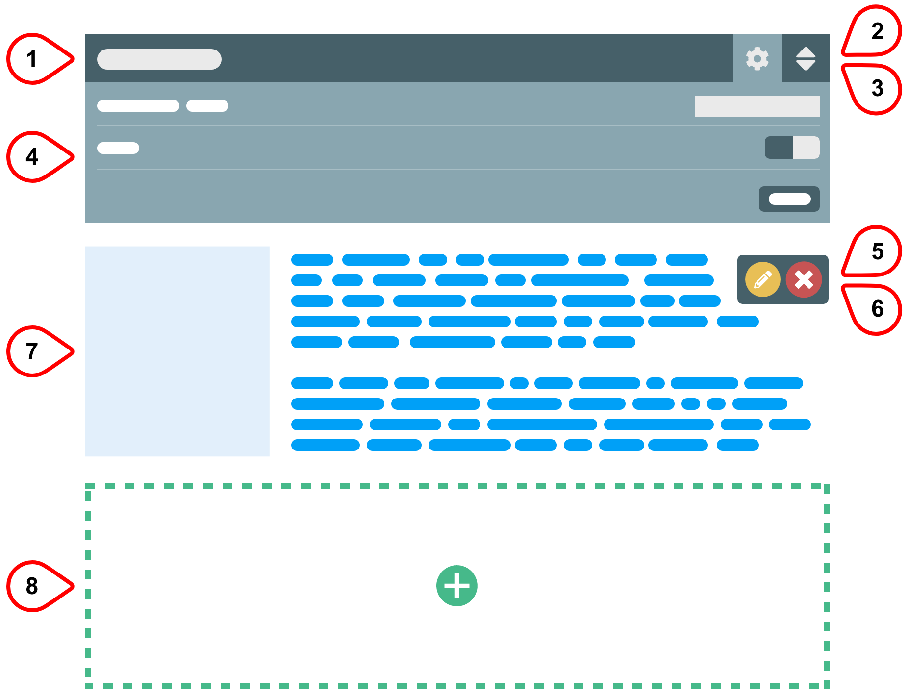

Control Bar - Displays the component name and provides a “safe click” area for selecting the component.
Options Gear - (Optional depending on component) Reveals and hides the component options to adjust component-specific features. Options will change depending on the component.
Sorting Arrows - (Optional depending on component) Opens the Sort Content Items window that allows you to rearrange content sections within the component.
Component Options - Component-specific options for making changes across the entire component. Allows you to see your changes updated live on the page.
Edit Pencil - Opens the editing window where you enter content into the component.
Delete - Permanently removes a section of content from within the component.
Preview - Live preview of content entered into the component. Many components come with default content to help you get started.
Add Section - (Optional depending on component) Adds a new section of content to the component.
Interface elements also share a consistent color scheme to show their function:
= EditStatus colour Yellow title yellow
= DeleteStatus colour Red title red
= AddStatus colour Green title Green
Working with Components on a Page
As your content changes you will need to add, move, and delete components in your pages. This work is all done within placeholders.
Below are the most common ways of working with components within placeholders. Click their title to expand the instructions.
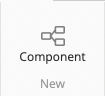
Adding a Component
| Anchor | ||||
|---|---|---|---|---|
|
| Expand | ||
|---|---|---|
| ||
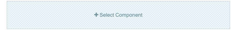
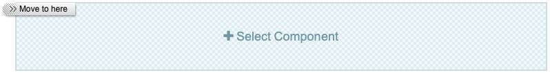
 Empty placeholders can only be seen in edit mode and are labeled with +Select Component.
|


| Expand | ||
|---|---|---|
| ||
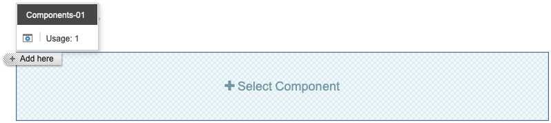
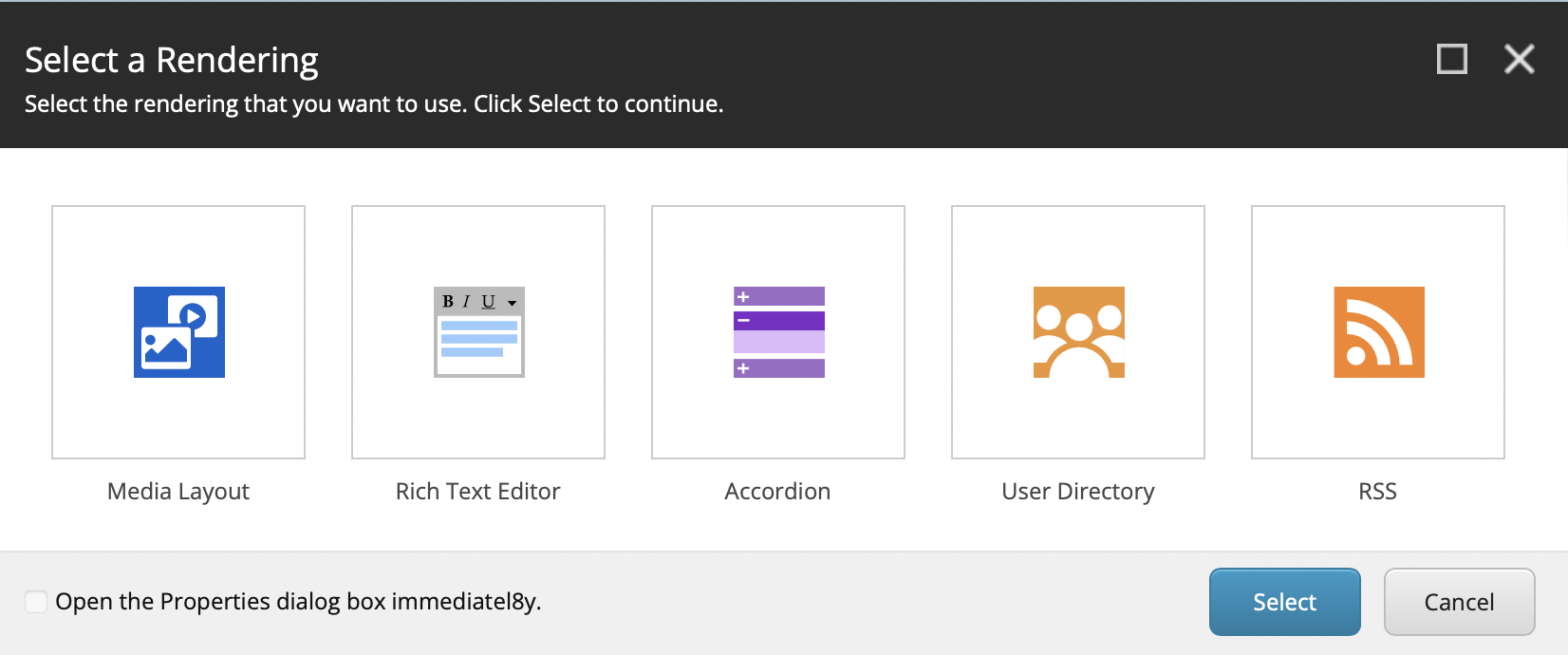
When all of the placeholders on the page already have components, you will not see the large, empty + Select Component placeholder. You can still add components to the existing placeholders with the following steps:
|

Moving a Component
| Anchor | ||||
|---|---|---|---|---|
|
| Expand | ||
|---|---|---|
| ||
 Components can be reordered within the same placeholder or moved to other placeholders on the page.
|


Deleting a Component
| Anchor | ||||
|---|---|---|---|---|
|
| Expand | ||
|---|---|---|
| ||
 Components can be permanently deleted from
|

Was this helpful? We welcome feedback for this Sitecore documentation: Take the User Survey