Full Width Layout
Display a single large image or video above a title and paragraph of text.
On This Page
| Table of Contents | ||||
|---|---|---|---|---|
|
Related Pages
| Child pages (Children Display) | ||
|---|---|---|
|
Adding the Full Width Layout
The Full Width layout can only be added as a final step from the Media Layout component.
Editing the Component Content
Hover your mouse cursor over the content preview area and click the yellow Edit button that appears over the top right of the component. A new modal window will open with all of the content fields available for the component.
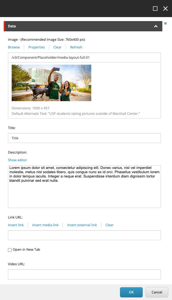
Image - Adds an image to the top of the component.
Title - Adds a line of styled text underneath the image.
Description - Adds a Rich Text Editor underneath the title.
Link URL - (Optional) Inserts a link to both the image and title that visitors can click to follow.
Video URL - (Optional) Inserts a Youtube or Vimeo link to the image area and overlays a play button.
When visitors click anywhere on the image, the video will play in an overlay over the entire page.
To use the video’s thumbnail, clearing the image field.
| Tip |
|---|
Can I do both? - Yes, you can add both a Link URL and a Video URL to the component at the same time. When you do, the image area will act as the playable video and the title will act as the link. |
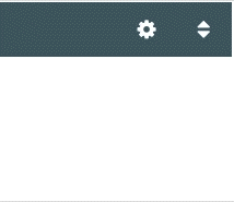
Component Options
Clicking the gear icon at the top right of the component’s control bar expands the options where you can adjust the component’s features.
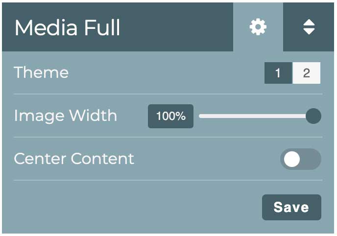
Theme - Change the look by selecting between different visual styles.
Image Width - Increase or decrease the displayed width of the image.
Center Content - Toggle to choose between left or center alignment of the image, title, and description.
Save - Commit any changes to the options.
Sort Content Items


Clicking the Sort button at the top right of the component’s control bar allows you to sort the content items into whatever order you choose.
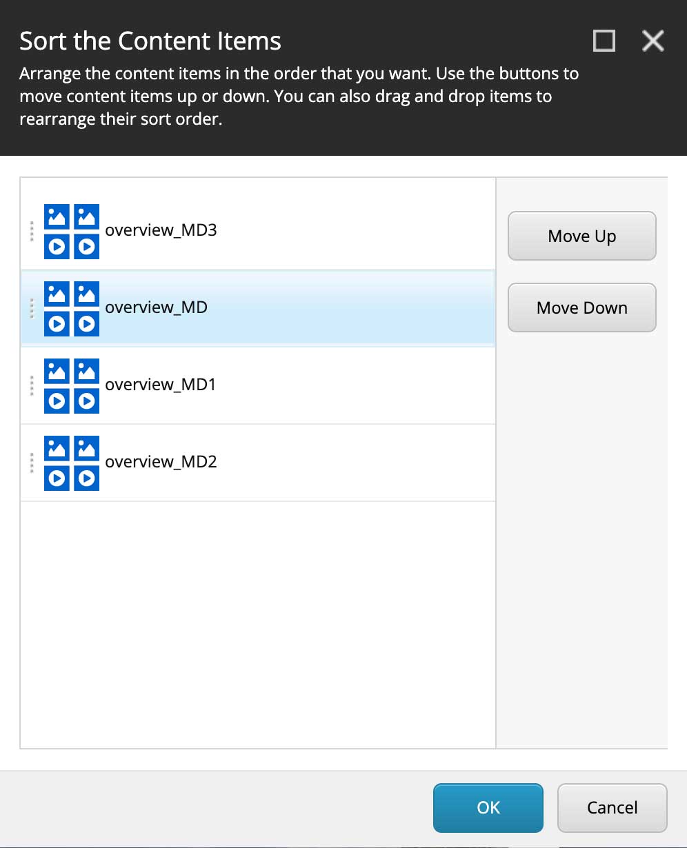
The Sort button will bring up a modal window to Sort the Content Items.
Find and click the title of the item you want to move.
Use the buttons in the right column to arrange the item in the order you want.
Repeat for each item you want to move.
When all items are arranged to your liking, click the blue OK button in the lower right to confirm your choices.
Deleting Content Items
Content is deleted one content item at a time.
Find the item that you want to delete.
Hover your cursor over the item that you wish to delete.
Hovering reveals the control buttons.
Click the red Delete button.
A message will pop up asking for your confirmation and display the item’s title.
If you clicked by mistake, click the gray Cancel button in the lower right and nothing will be deleted.
To confirm deletion, click the blue OK button in the lower right. The window message will update to tell you that the item was deleted and ask to refresh the page. Click OK again.
The page will refresh and the deleted item will be gone.
| Info |
|---|
If you deleted an item by mistake, it can be recovered from /wiki/spaces/DIT/pages/20546093067. |
Image Specifications
Maximum Width: 1,000 px @ 72 dpi
Recommended File Size: 150 - 300 KB
| Info |
|---|
|
Was this helpful? We welcome feedback for this Sitecore documentation: Take the User Survey