 Image Removed
| Section |
|---|
|
The below tables provide the refresh schedule for dashboards available through the ODS . The 'Refresh Benchmark' and corresponding dates indicate when the dashboard/report is refreshed for the specified term to load the data for the specified benchmark.
For questions, please contact ods-data-help@usf.edu
and Analytics, ODS
| Panel |
|---|
| titleColor | white |
|---|
| titleBGColor | #006747 |
|---|
| title | ODS Student Success Hub: Dashboard Refresh Schedules |
|---|
| | Expand |
|---|
| title | Filters/Slicers on a visual |
|---|
|
To find out what are the filters on any particular visual, select that visual and hover by the top right-hand side, a menu bar of options will appear. There will be an option that looks like Filter or three horizonal bars. When you select that, you can see what slicers are impacting that visual. Currently this menu bar is not available for Line Charts.
There will be an option that looks like Filter or three horizonal bars. When you select that, you can see what slicers are impacting that visual. Currently this menu bar is not available for Line Charts.
 Image Removed
 |
| Expand |
|---|
| If you have made any changes, such as implementing filters or sorting the table, you have the ability to return the sorting and filtering to the report creator's default view. Click the Reset to Default image above the report in the Report Header: Image Removed Image Removed Image Added Image Added When you click on the option, a dialogue will confirm: Image Removed Image Added Image Added When you select Reset and the default setting for the report is active, the Reset button Image Removed  Image Addedwill disappear. Image Addedwill disappear.  Image Added Image Added space |
| Expand |
|---|
| title | Filters/Slicers on a visual |
|---|
| To find out what are the filters on any particular visual, select that visual and hover by the top right-hand side, a menu bar of options will appear. There will be an option that looks like Filter or three horizonal bars. When you select that, you can see what slicers are impacting that visual. Currently this menu bar is not available for Line Charts. There will be an option that looks like Filter or three horizonal bars. When you select that, you can see what slicers are impacting that visual. Currently this menu bar is not available for Line Charts. Image Removed  Image Added Image Added space |
| Expand |
|---|
| title | Export Data to Excel |
|---|
| To export the data results to Excel, hover your mouse over the upper right hand side corner of the data table and a horizontal menu bar Image Removed  Image Added will pop up. Click the Image Removed Image Added will pop up. Click the Image Removed  Image Added in the top right corner. Image Added in the top right corner. A drop-down menu will appear with 'Export data' as one of the options. Select Export Data to work with the data in Excel. Note: The exported data in Excel may not look exactly like the screen.
Image Removed 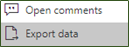 Image Added Image Added
Image Removed Image Added Image Added space |
| Expand |
|---|
| title | Charts or Graph Visuals: Data in a table format |
|---|
| To see the data for any chart or graph, hover over the top right-hand | Matrix Visual: Drill Up and Drill Down |
| If the visual has the hierarchy, the  Image Addedmenu will appear when you hover on the top left side of the visual and click on three horizonal dots. From the menu options, select “Show as a table”. Turn on drill down first by selecting the downward arrow. The grey background Image Addedmenu will appear when you hover on the top left side of the visual and click on three horizonal dots. From the menu options, select “Show as a table”. Turn on drill down first by selecting the downward arrow. The grey background  Image Added lets you know that drill down is active. Image Added lets you know that drill down is active. Image RemovedYou can see the data table below the chart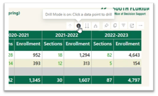 Image Added Image Added Selecting  Image Addedwill expand another level of hierarchy. Image Addedwill expand another level of hierarchy. Image Removed If you want to see the chart and table side by side, you can switch it to vertical layout by clicking on the “Switch format.” 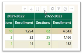 Image Added Image Added Selecting the double arrow  Image Added drill-down icon takes you to the next level in the hierarchy. Image Added drill-down icon takes you to the next level in the hierarchy. Image Removed Image Removed 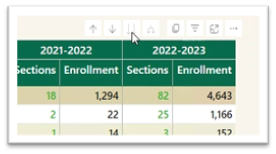 Image Added Image Added Selecting  Image Addedwill take you one level up in hierarchy. The arrows will be greyed out if the option is not available. Image Addedwill take you one level up in hierarchy. The arrows will be greyed out if the option is not available. space |
DegreesDoctoral Research Student Success DashboardHeadcount ReportsSCH ReportsSID Benchmark Refresh LogStudent Success Research & Analytics (SSRA)Student Success Modality ReportTransfer Student Success Suite| Expand |
|---|
| title | Matrix Visual: Drill Up and Drill Down |
|---|
| If the visual has the hierarchy, the Image Removedmenu will appear when you hover on the top left side of the visual. Turn on drill down first by selecting the downward arrow. The grey background Image Removed lets you know that drill down is active.| Charts or Graph Visuals: Data in a table format |
| To see the data for any chart or graph, hover over the top right-hand side of the visual and click on three horizonal dots. From the menu options, select “Show as a table”. Image RemovedSelecting Image Removedwill expand another level of hierarchy  Image Added Image Added You can see the data table below the chart. Image Removed Selecting the double arrow Image Removed drill-down icon takes you to the next level in the hierarchy.  Image Added Image Added If you want to see the chart and table side by side, you can switch it to vertical layout by clicking on the “Switch format.”
Image Removed Selecting Image Removedwill take you one level up in hierarchy. The arrows will be greyed out if the option is not available. |
|
| Panel |
|---|
| titleColor | white |
|---|
| titleBGColor | #006747 |
|---|
| title | You Might Also Be Interested In... |
|---|
|
 Image Added Image Added  Image Added Image Added
|
|


