Power Bi Tips
- Sangita Singh
- Penchala Akshay Kumar Kandagaddala
If you have made any changes, such as implementing filters or sorting the table, you have the ability to return the sorting and filtering to the report creator's default view. Click the Reset to Default image above the report in the Report Header:
When you click on the option, a dialogue will confirm:
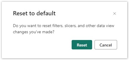
When you select Reset and the default setting for the report is active, the Reset button  will disappear.
space
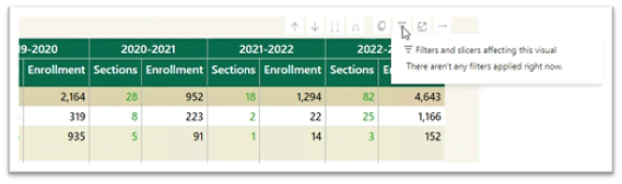
To find out what are the filters on any particular visual, select that visual and hover by the top right-hand side, a menu bar of options will appear. There will be an option that looks like Filter or three horizonal bars. When you select that, you can see what slicers are impacting that visual. Currently this menu bar is not available for Line Charts.
There will be an option that looks like Filter or three horizonal bars. When you select that, you can see what slicers are impacting that visual. Currently this menu bar is not available for Line Charts.

space
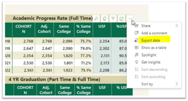
To export the data results to Excel, hover your mouse over the upper right hand side corner of the data table and a horizontal menu bar  will pop up. Click the
  in the top right corner.
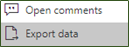
A drop-down menu will appear with 'Export data' as one of the options. Select Export Data to work with the data in Excel.
Note: The exported data in Excel may not look exactly like the screen.
space
Focus Mode:
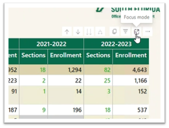
To see the data in Focus Mode, hover your mouse over the upper right hand side corner of the data table and a horizontal menu bar  will pop up. Click the option for Focus Mode
  . It allows the visual to take the entire space in the report canvas.
Full screen mode will persist until you exit out or click at the top left-hand side.
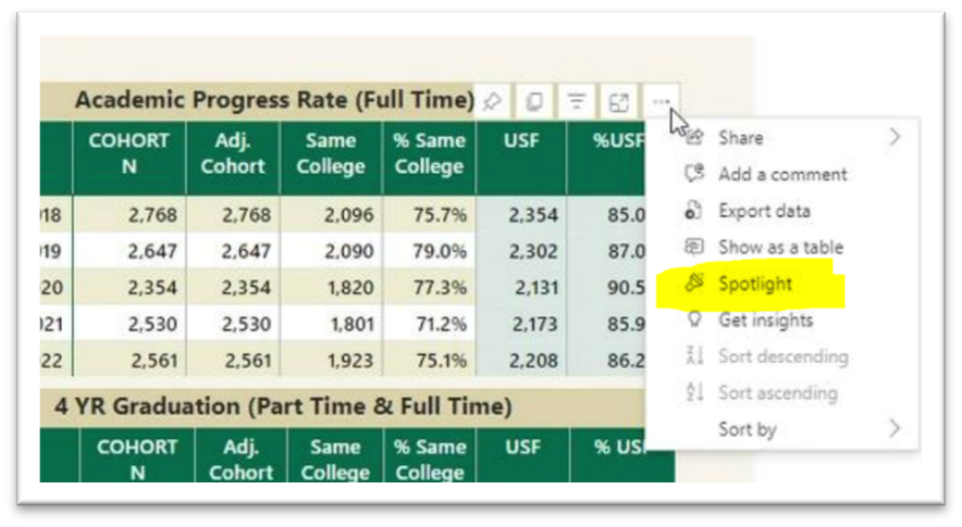
Spotlight:
Spotlight causes all other visuals on the page to fade so the selected visual is highlighted. To highlight a visual, click on more action  and select
space
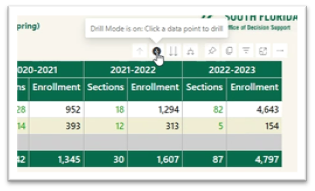
If the visual has the hierarchy, the  menu will appear when you hover on the top left side of the visual. Turn on drill down first by selecting the downward arrow. The grey background
  lets you know that drill down is active.
Selecting  will expand another level of hierarchy.
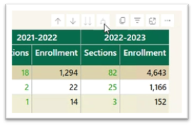
Selecting the double arrow ![]() drill-down icon takes you to the next level in the hierarchy.
drill-down icon takes you to the next level in the hierarchy.
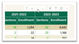
Selecting  will take you one level up in hierarchy. The arrows will be greyed out if the option is not available.
space
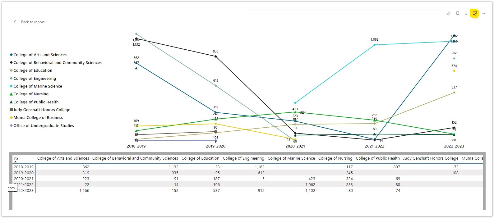
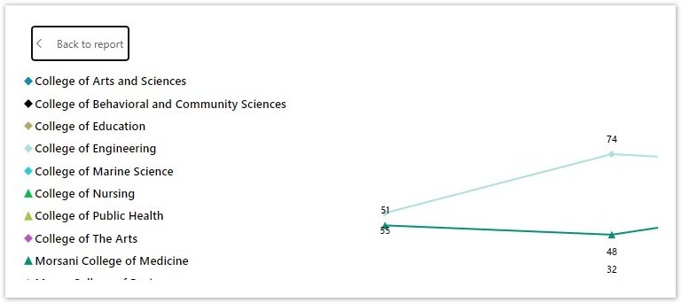
To see the data for any chart or graph, hover over the top right-hand side of the visual and click on three horizonal dots. From the menu options, select “Show as a table”.
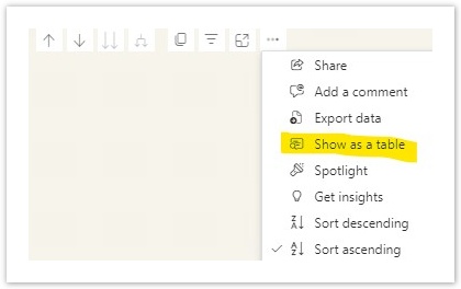
You can see the data table below the chart.
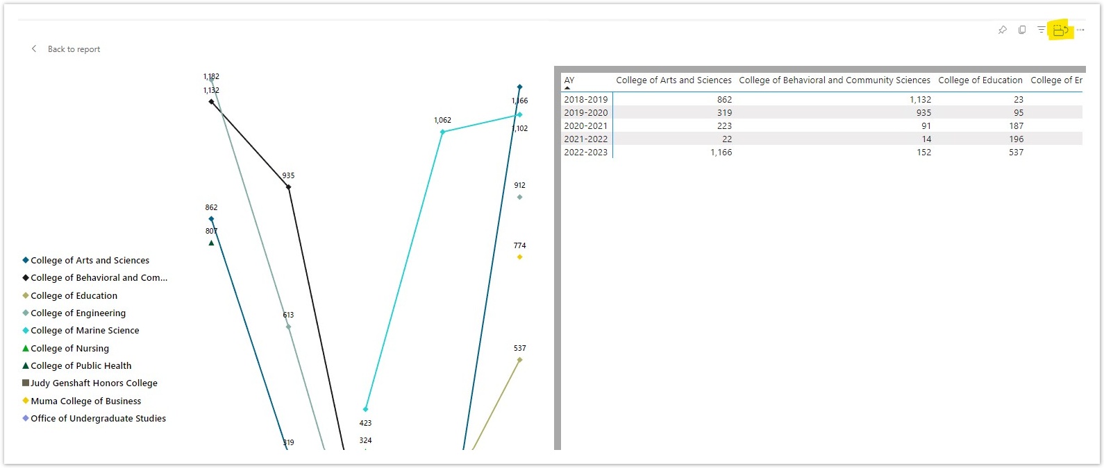
If you want to see the chart and table side by side, you can switch it to vertical layout by clicking on the “Switch format.”