Accordion Component
Accordion
This page will help Sitecore Contributors become familiar with the Accordion Component. The Accordion component is used to show information that can be expanded or collapsed.
How to Add an Accordion Component
Best Practice
Accordions should not be used to hide critical content. You can use an accordion to shorten page content, but steer away from concealing critical content because your audience may miss the information that you are trying to impart. An Accordion component cannot be created as the first component on a home page.
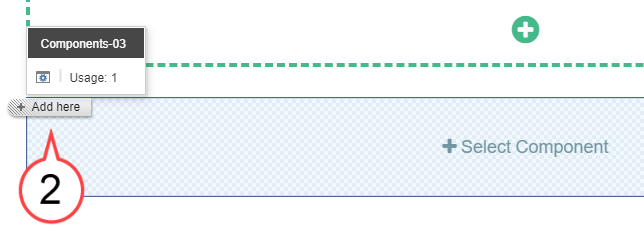
- Select the +Select Component area. (see image below)

- Select the + Add here button. (see image below)
Choose Accordion. (see image below)
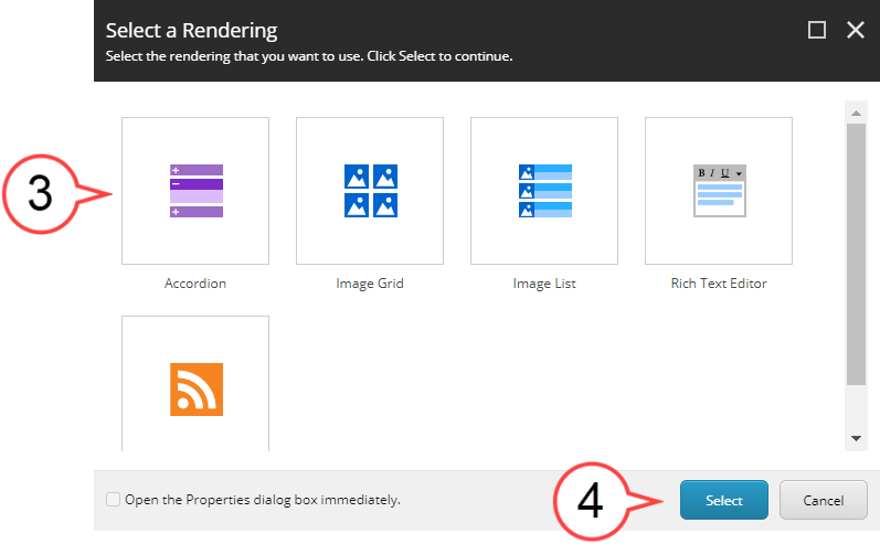
You can also double-click the Accordion icon to select it.
Select Select. (see image above)
- Select Add Component. (see image below)

Select the Gear Icon to add a headline (adding a headline is optional). (see image below)
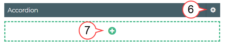
Select the Plus Icon. (see image above)
Hover in the area next to Title. (see image below)
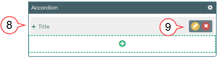
Select the Pencil Icon to edit. (see image above)
An existing Accordion component will often have existing text or image(s).
Best Practice
Develop an order for content being displayed to help your audience quickly find what they need. Consider using alphabetical, chronological, or numerical ordering if possible.
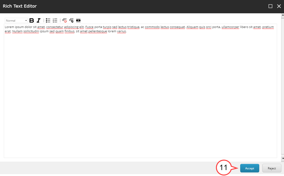
- Select Show editor or double-click the text in the area to edit. (see image below)

Select Accept to finalize the edits. (see image below)
If the layout option chosen had multiple sections, complete for each section.
Review the edited sections to ensure all edits have been made. (see image below)
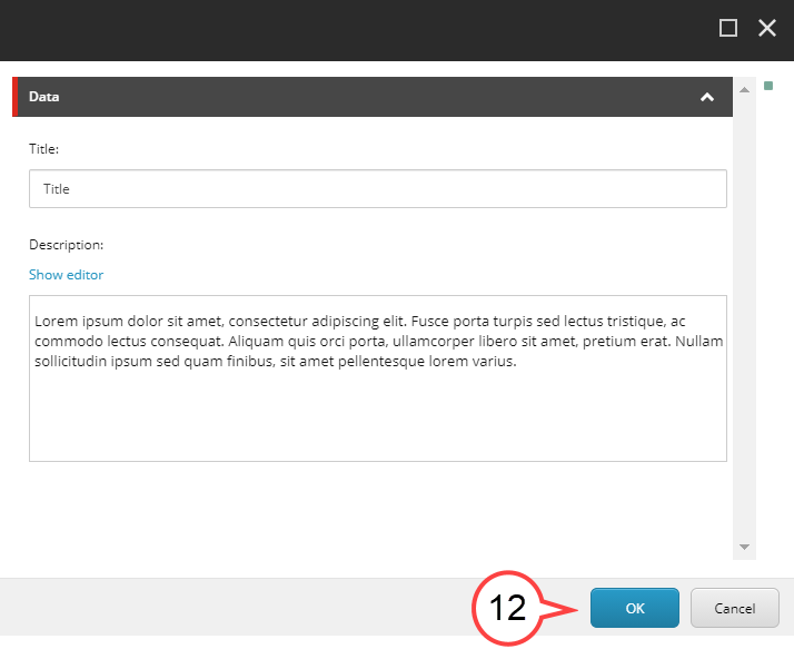
Select OK.