Hero Banner Component Home Page
Hero Banner
The Hero Banner component is one of three component options that can be used as the first component on a home page. For this reason it is listed as a home page type. Hero Banner allows for a landscape photo with a text overlay to be featured along with a 'Call to Action' link.
- This is a landscape image format by default and the recommended image size is 1000 x 425 px.
- There are 3 themes, which are all optimal for use. Review each theme for the best visual structure and impact for this component.
How to Edit an Existing Hero Banner Component
- Hover over the body of the component. (see image below)
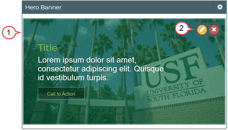
2. Select the pencil icon. (see image above)
Is the editor taking a while to open? Try double-clicking the pencil icon.
3. Select Browse. (see image below)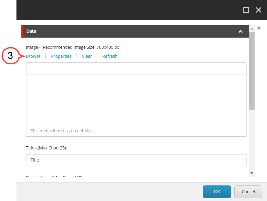
4. Navigate to the image. (see image below)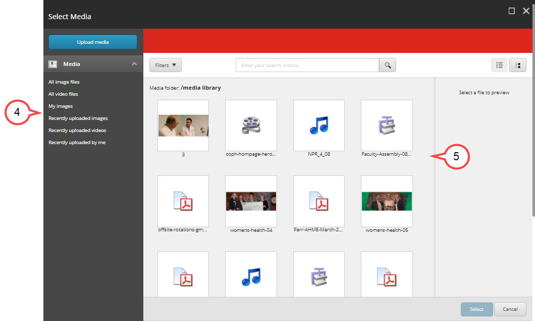
5. Select the image. (see image above)
Images Best Practices
- Avoid images that have text or writing on them.
- Find images that are appropriate for the section and page.
- Images for this component should be landscape
- Recommended image size is 1000 x 425 pixels
- Avoid images that are "too casual, informal, or suggestive in nature.
- Also there should not be any images that depict third party logos except for NIH, CDC -USF affiliates - with approval from your department and the organization.
- Images should be in one of the following formats:
PNG
JPEG
GIF
*TIFF and EPS images are often too large for web use.
To Upload a New Image
1. Select Upload Media.(see image below) 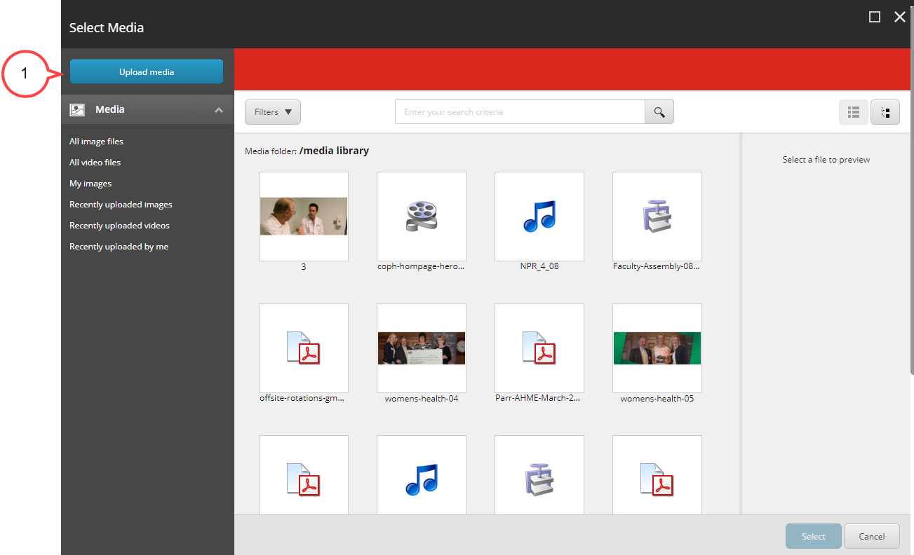
2. Select Change Destination to confirm you are uploading to the correct folder. (see image below)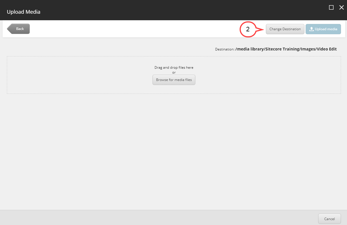
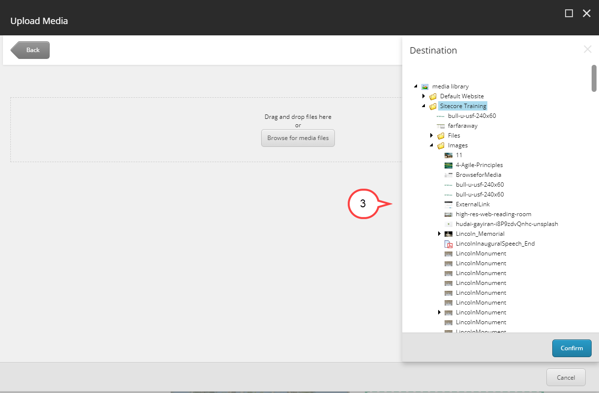
3. Select your departments image folder. (see image below)
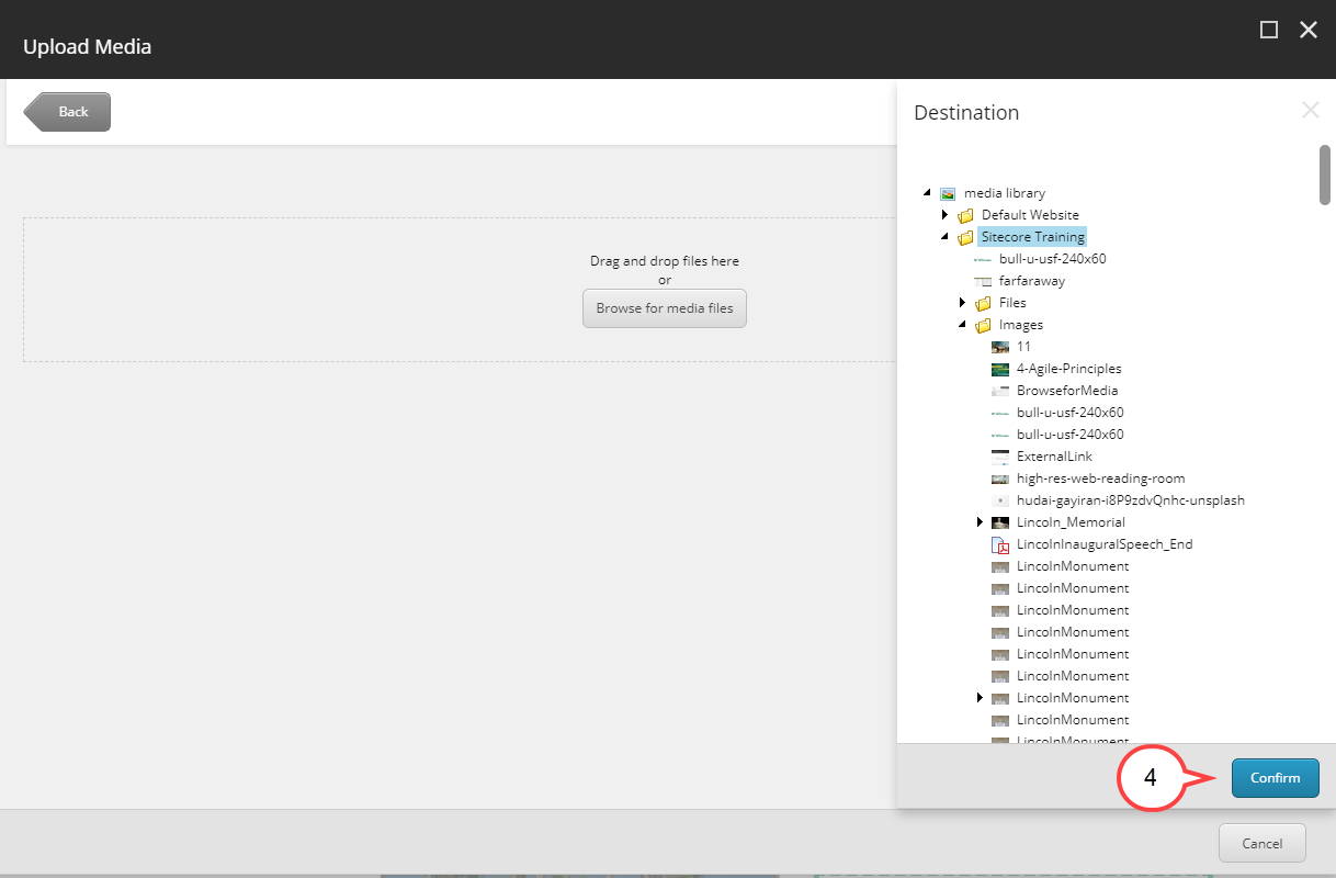
4. Select Confirm.(see image below)
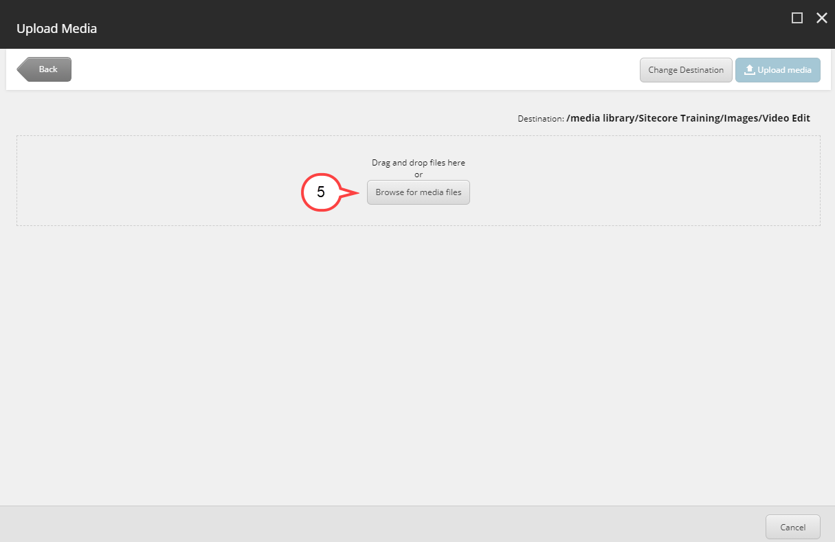
5. Select Browse for media files. (see image below)
6. Select the image from your computer.
7. Select Open.
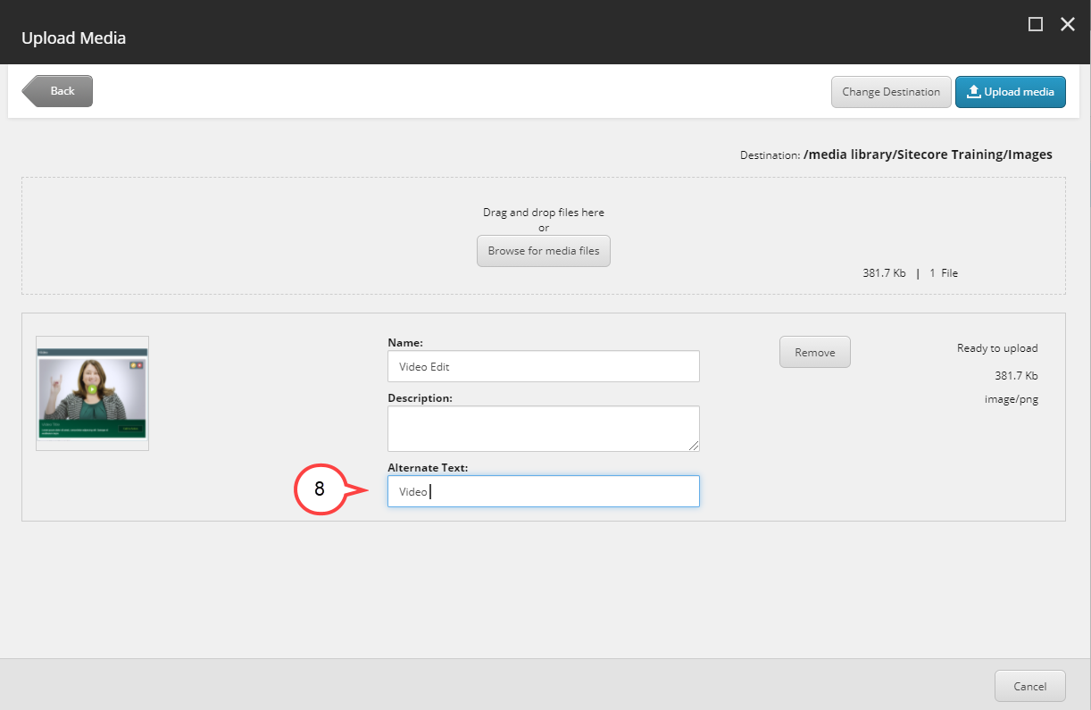
8. Type in Alternative Text. (see image below)
Best Practices
Alt Text should be a paraphrasing of a description of the image. For example, if the image is of a particular building the Alt text may say "Front Entrance of Morsani Building on USF Campus". When penning these descriptions this text is used to aid accessibility and for SEO touch points.
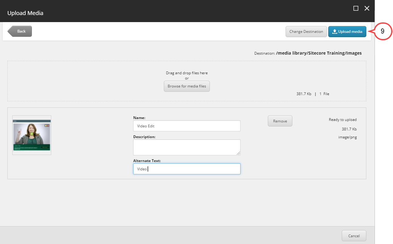
9. Select Upload media. (see image below)
10. Select the image. (see image below)
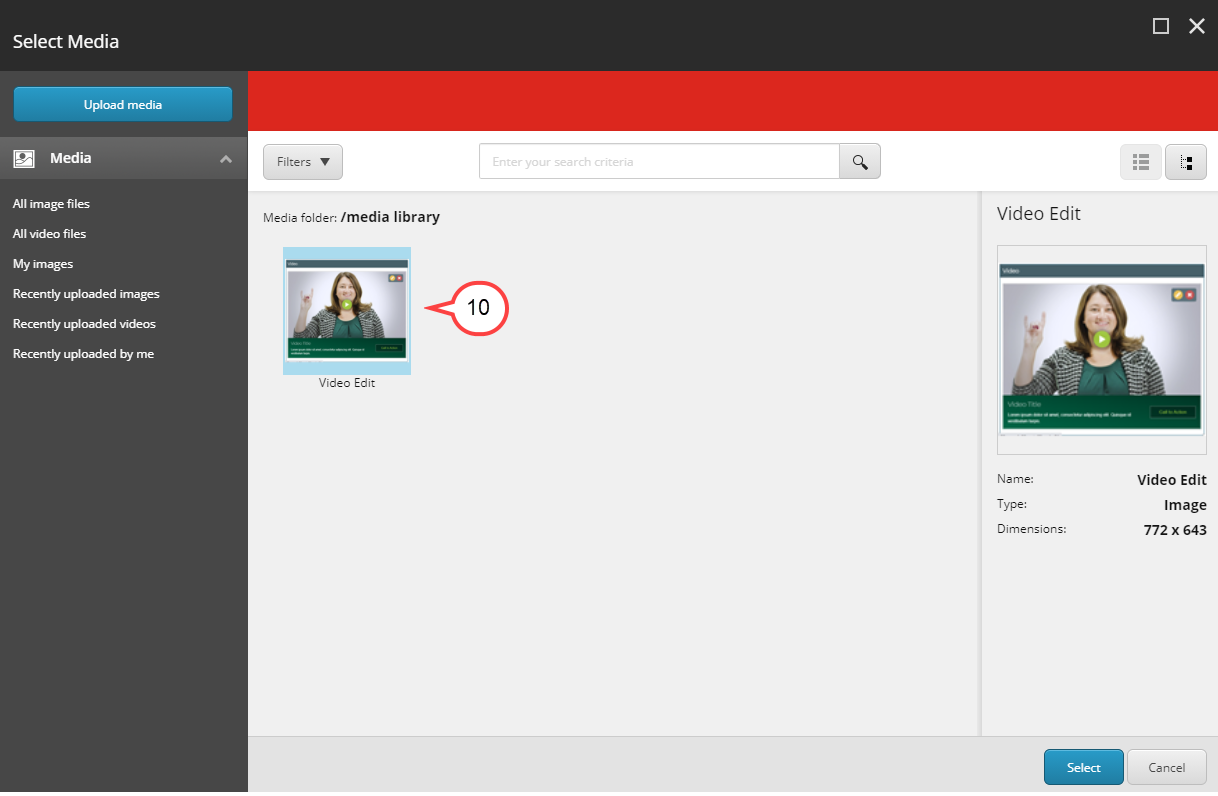
Continue to Step 6 below.
6. Select Select.
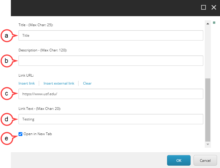
7. Fill in the following fields:
a. Title: This will be the title that displays with the image.
b. Description: This will be the text that displays with the image.
c. Link URL: This is where you insert the URL for the Call to Action button.
d. Link Text: This will be the text that will display on the Call to Action button.
e. Open in New Tab: Make sure Open in New Tab is selected.
Don't want a Title, Description, or Call to Action button?
To remove a Title, Description, Link URL, or Link Text included in the Hero Banner, leave the appropriate field(s) blank. Also be aware that each field has a different character limit.
Title: 25 character max
Description: 120 character max
Link Text: 20 character max
8. Select OK.
9. Select the gear icon to customize the Hero Banner. (see image below)
a. Theme: This will give you options to change the look and feel of the slide show.
b. Opacity: Move the slider to make the overlay darker or lighter.
c. Text Position: This setting will change the position of the text.
d. Save: Select Save if you have made any changes.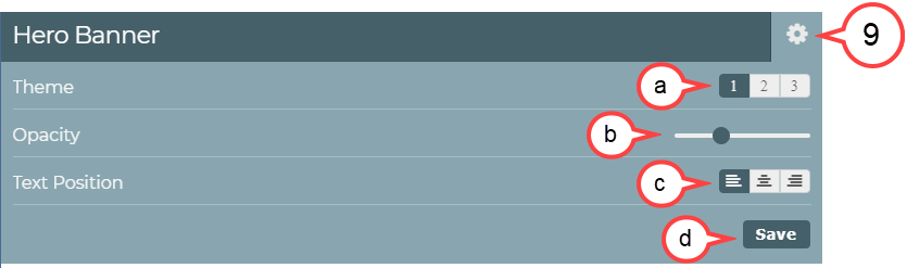
Setting the opacity higher than 60% may make the text hard to read