Image List and Image Grid Components
Image List and Image Grid
For this version of Sitecore, rows and columns are used to add images. The two methods of this are the Image List component and the Image Grid component. The Image List allows for two display methods of either landscape (the default) or portrait. Images will always be left justified next to text. For the Image Grid, images are not accompanied by a paragraph of text but by a title and a text overlay.
Image List Features
Here are the features of the Image List component in Sitecore V3. Below is the basic layout (see image below):
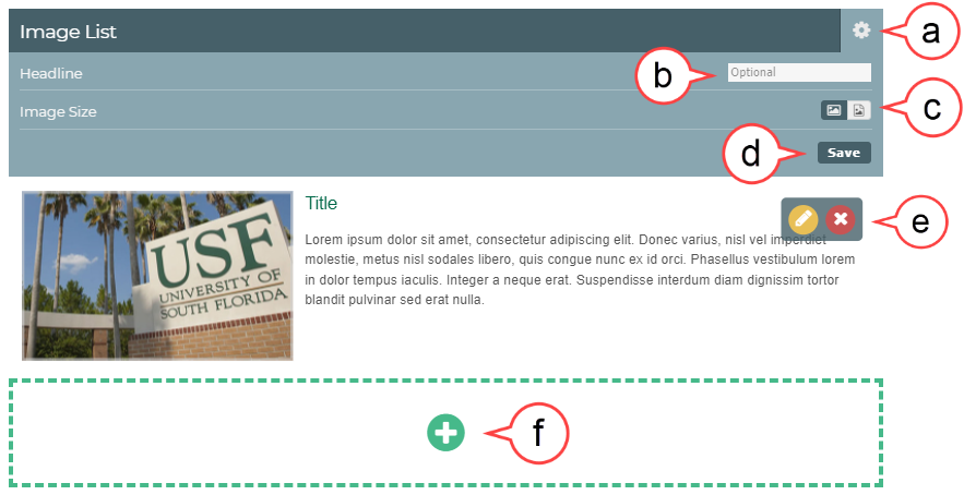
a. Gear Icon: Opens settings options
b. Headline: Adding a Headline is optional
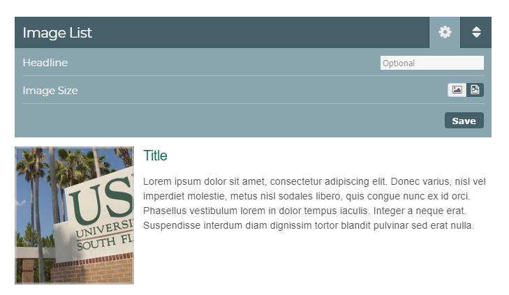
c. Image Size: An image can be changed from landscape to portrait using this function (see image below)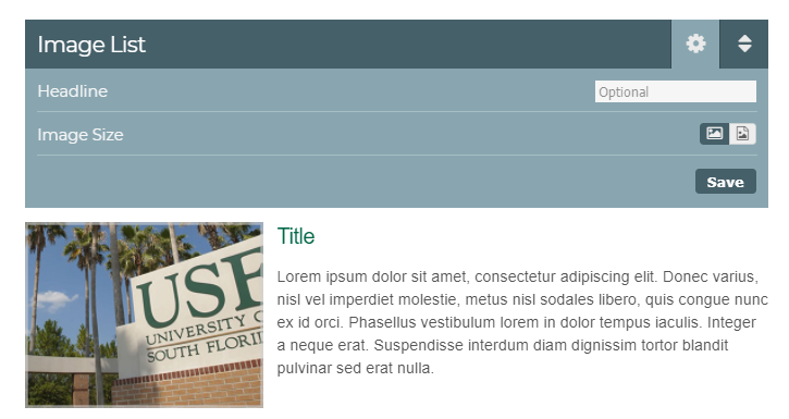
d. Save: Select Save if you have made any changes to these settings
e. Edit Icons: The pencil icon opens the editor and the X icon deletes the content
f. Plus Icon: Adds a list row
It is not recommended to add more than four rows as this will compromise the integrity of the page by reducing accessibility
Best Practices
Make sure the destination folder is correct if you're uploading a new image and Alt Text is included.
Recommended photo settings for:
Landscape: 365 x 200 px or roughly 4.86 x 2.66 in
Portrait: 200 x 365 px or 2.66 x 4.86 in
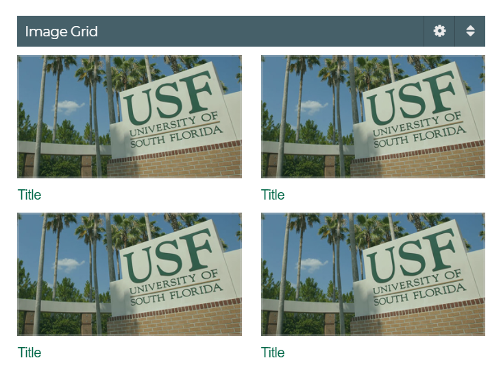
Image Grid Features
Here are the features of the Image Grid component in Sitecore V3. Below is the basic layout (see image below):
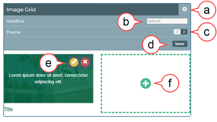
a. Gear Icon: Opens settings options
b. Headline: Adding a Headline is optional
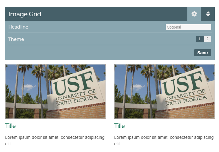
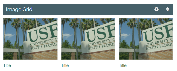
c. Theme: Two layouts options that allow for just title text under the image or title and descriptive text under the image (see image below):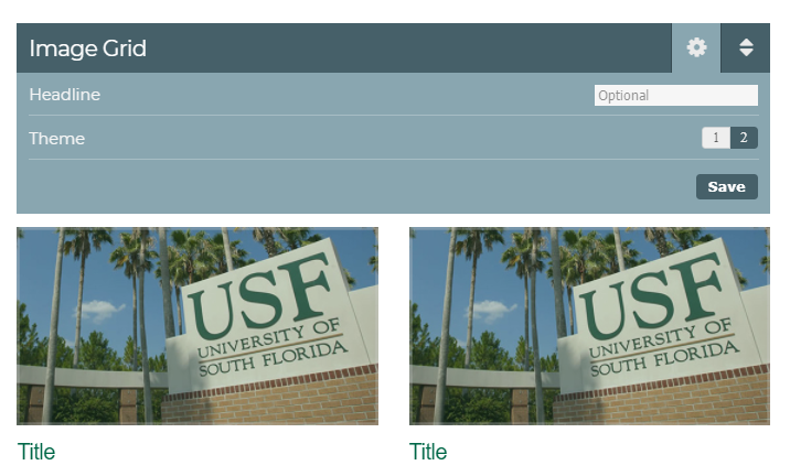
d. Save: Select Save if you have made any changes to these settings
e. Edit Icons: The pencil icon opens the editor and the X icon deletes the content
f. Plus Icon: Adds a new image
The minimum number of images that can be added is 1. The maximum number of images that can be added is 4. 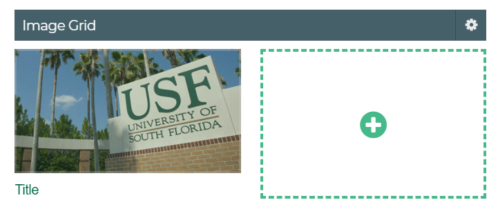
Best Practices
Only use landscape images that are 365 x 200 px or roughly 4.86 x 2.66 in
Only use one Image Grid on the same page.
How to Choose an Image from the Media Library
- Hover over the picture you want to replace
- Select the Pencil icon
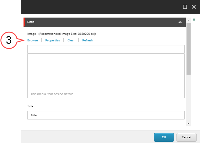
- Select the Browse button to open the Media Library. (see image below)
- Search for the image you want to use
- Select the image once you've found it
- Select Select
How to Upload a New Image to the Media Library
- Hover over the picture you want to replace
Select the Pencil icon
Select the Browse button to open the Media Library (see image below).
Pay attention to the recommended image size located above the Browse button. Following this sizing will help your page to look its best.
- Select Upload Media
Select Destination
Always check the folder you are uploading to. If needed, click Change Destination, and navigate to the folder where your images should be located and confirm.
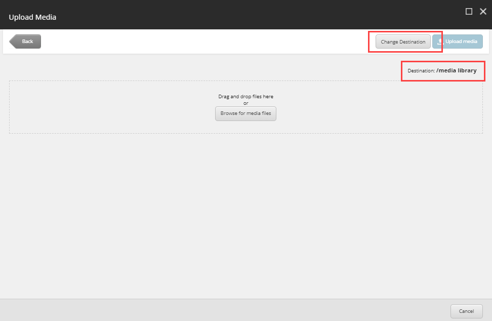
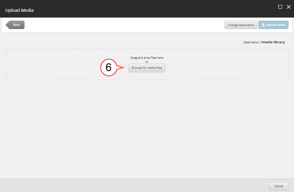
Select Browse for Media Files (see image below)
Best Practices
- Avoid images that have text or writing on them.
- Find images that are appropriate for the section and page.
- Avoid images that are "too casual, informal, or suggestive in nature.
- There should not be any images that depict third party logos except for NIH, CDC -USF affiliates - with approval from your department and the organization.
- Images should be in one of the following formats:
PNG
JPEG
GIF
*TIFF and EPS images are often too large for web use.
Select image to upload
Type the Name, Description, and Alternate Text for your image
Best Practices
- Always enter alternate text (alt text), under Alternate Text, as this will ensure it does not have be to entered every time the image is used.
- Alt Text should be a short paraphrasing of a description of the image. For example, if the image is of a particular building, the Alt text may say "Front Entrance of USF Morsani Building". These descriptions are used to aid accessibility.
Select Upload Media
- Select image
- Select Select