| Anchor | ||||
|---|---|---|---|---|
|
This page of the user guide will help Sitecore Contributors add and become familiar with the Accordion Component. The Accordion is a component that is used to show information in list form within Sitecore. It should be noted that Accordion cannot be created as the first component only Hero Banner, Slideshow, and Video components can be used as the first component. It should be noted that although some components are already on the page, all directions are starting as if the component needed is not available on the page and needs to be added.
that can be expanded or collapsed.
| Info | ||||
|---|---|---|---|---|
| ||||
Becoming Familiar with the Interface: Sitecore Advanced Editing Components Interface Home Page Components: Hero Banner Component Home Page Content Page Components: Image List and Image Grid Components |
How to Add an Accordion Component
| Info | ||
|---|---|---|
| ||
Accordions should not be used to hide critical content. You can use an accordion to shorten page content, but steer away from concealing critical content because your audience may miss the information that you are trying to impart. An Accordion component cannot be created as the first component on a page only Hero Banner, Slideshow, and Video components can be added/used as the first component on a home page. |
- Select anywhere in the +Select Component area to add a component.
 area. (see image below)
- Select the + Add here button.

In the pop-up window you will be given five options, choose Accordion and then select "Select".
Note The Accordion can be double-clicked to select it also.
 (see image below)
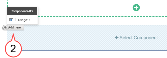
Choose Accordion. (see image below)
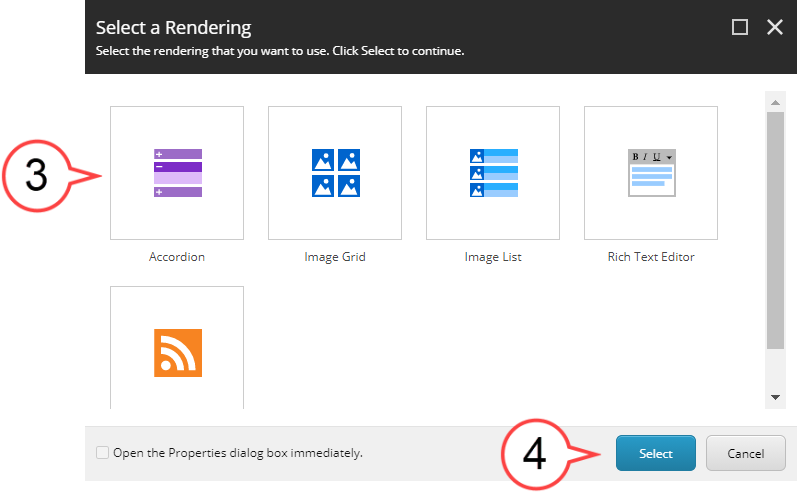
Note You can also double-click the Accordion icon to select it.
Select Select. (see image above)
- Select Add Component to create the Accordion component.
 . (see image below)
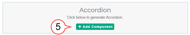
Select the Gear Icon if you want Icon to add a headline and then select the plus icon.

Hover over the area below the title bar (does this area have a specific name?) and select the pencil icon to edit.headline (adding a headline is optional). (see image below)
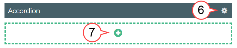
Select the Plus Icon. (see image above)
Hover in the area next to Title. (see image below)
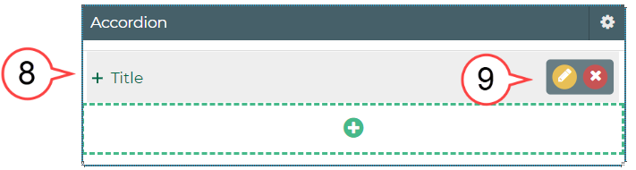
Select the Pencil Icon to edit. (see image above)
Note An existing Accordion component will often have existing text or image(s). Make sure you have navigated to a page you have been authorized to edit before making changes to an Accordion component.

Info title Best Practice Develop an order for content being displayed to help your audience quickly find what they need. Consider using alphabetical, chronological, or numerical ordering if possible.
- Select Show editor or double-click the text in the area to edit.

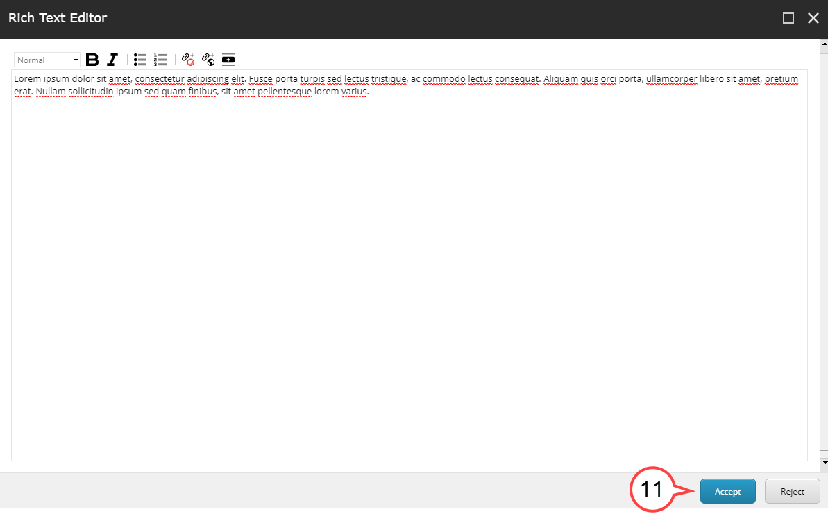
Once all edits are completed select (see image below)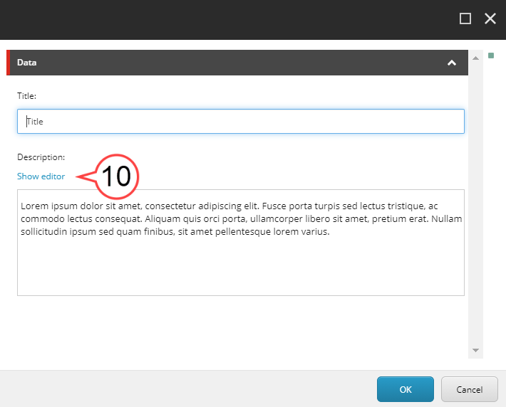
Select Accept to finalize the edits
or Reject to leave the editor without making any changes.. (see image below)
Note If the layout option chosen had multiple sections, complete for each section.

Review the edited sections to ensure all edits have been made
and then select. (see image below)
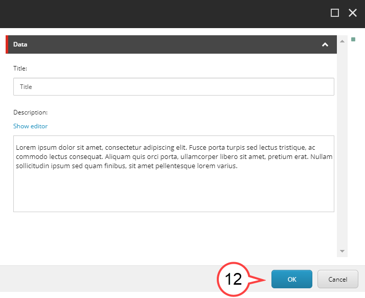
Select OK.

Note icon false Please click this link to give feedback for this documentation and using Sitecore Advanced Editing Components: User Survey